Finding timeless in a trendy world: IMM-Cologne top 5

Finding timeless in a trendy world: IMM-Cologne top 5

We have a love-hate relationship with the word “trend”- as we know most of you do.

Trendy might very well mean your new purchase will go out of style sooner than later. We prefer to focus on longevity in our pieces and in design—items you’ll cherish both now and in 20 years. When we travel to international design shows over the course of a year, debuting what’s new and current, we look for not necessarily the trendy but the timeless. This year, at IMM in Cologne, Germany, and Maison Objet in Paris, France, we discovered timeless inspiration aplenty! Check out some photos and over-arching themes we see repeatedly below, & let us know your thoughts!

Reflections: *non* trends at IMM Cologne and Maison Objet

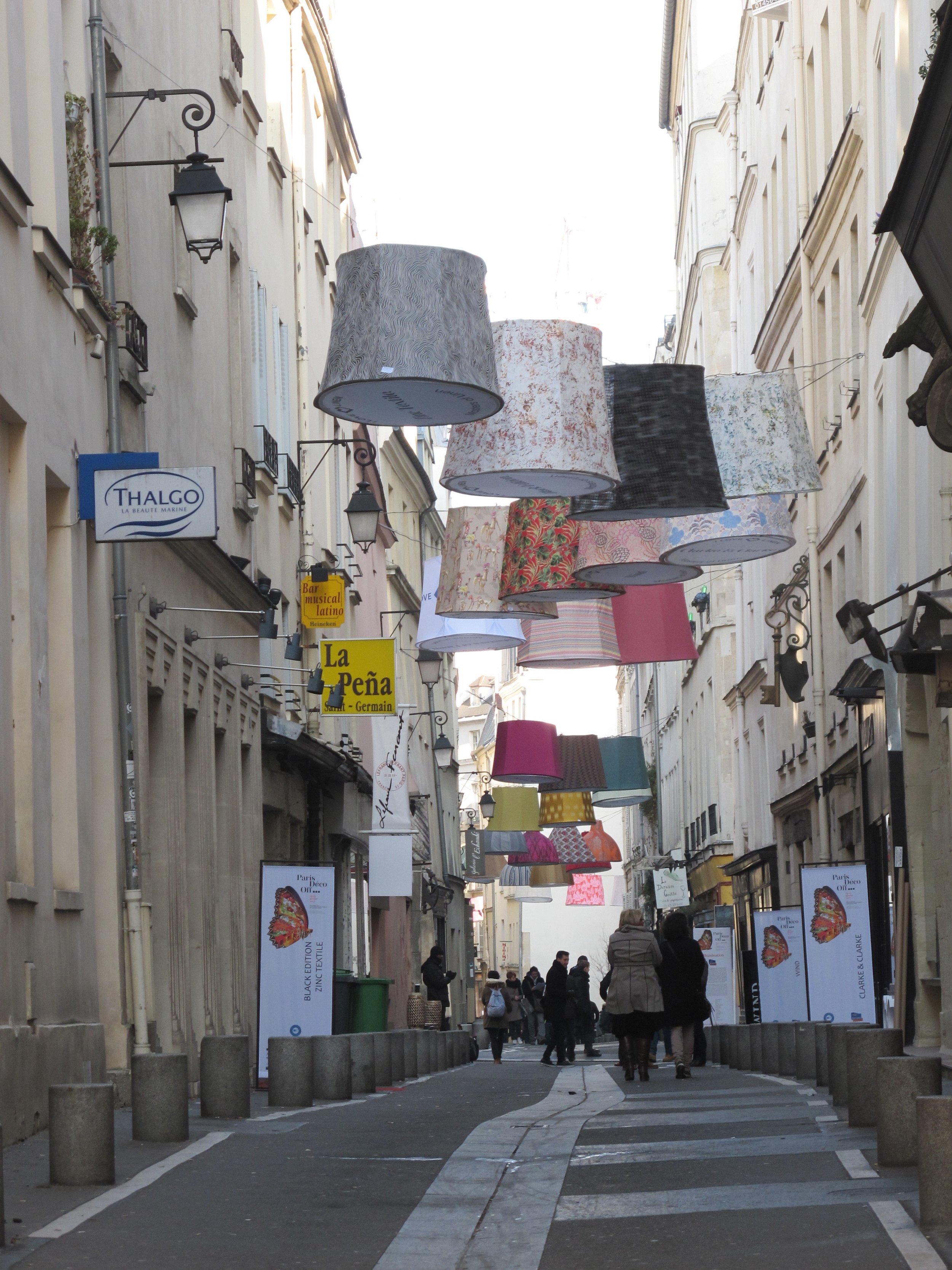
Digging for a fresh pair of hand-warmers in the bottom of my bag, I glanced up to check the next cross street name in the heart of Paris to see this.

On behalf of Design Lab, I had the privilege of attending IMM Cologne and Maison Objet this January for the first time.  Not only were the design shows spectacular in and of themselves—but the cities, the historical architecture and tried-and-true atmosphere of beauty made for the most stunning backdrop for the forefront of today’s conception of interiors, furniture, and objects: the architecture of our lives.

View of Cologne's cathedral across the Rhine River

View of Cologne's cathedral across the Rhine River

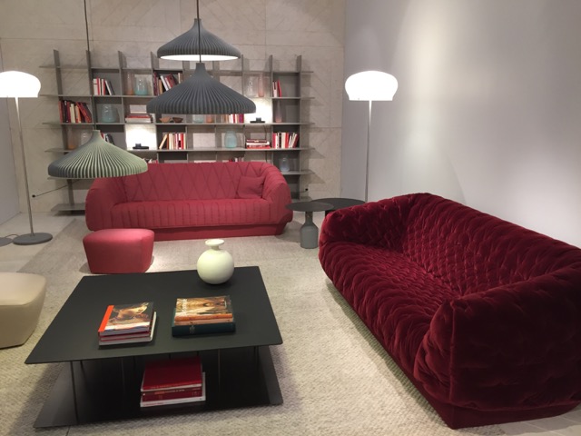
Just as the simple conceptual form of large, floating lamp-like shades wrapped in beautiful textiles stood juxtaposed perfectly against the traditional architecture of the narrow, quaint street in the Latin Quarter of Paris, Marie Christine Dorner’s contemporary Cover sofa appeared all the more charmingly ingenuous upon exiting IMM toward the Gothic spires of Kolner Dom. The fabric shades, and Ligne Roset’s debut Cover sofa alike, clearly stated their purpose in form: the shades advertised nearby company’s textiles using a truly flattering and eye-catching art installation while the sofa simply made the age-old, utilitarian idea of a slipcover the driving concept of the design.  Unlike much of their historical backdrop, these modern elements feature adornment and décor as necessity requires: the shades illustrate the design of the textile itself, and the Cover features quilting patterns which stabilize the cover’s inner cushioning (batting). 

Cover by Marie Christine Dorner - image courtesy of collection2017.ligneroset.com

Cover by Marie Christine Dorner - image courtesy of collection2017.ligneroset.com

Of course, this juxtaposition is nice and noteworthy—but there’s something more.

The word “trend” almost feels as if it precludes itself—but at Design Lab, we’re happy to say that we find this particular “trend” a more enduring and exciting philosophy, one that can easily live beneath the guise “eclectic.”  When designers are smart, not only refining an idea to birth its truest self, but also consider the role objects, furniture, buildings- stuff- has on our selves, our environment, and our planet, something amazing and beautiful happens: they make meaning.  They create meaningful moments that can not only co-exist with that which is—the ornate Rococo carvings and the deliberate, orthogonal strokes of the Bauhaus—but they celebrate the past and present with a timeless execution of an idea, a function. 

The fabric shade installation was absolutely delightful because of this transient, familiar image of glowing beacons guiding you from above, lighting your path (wish we took a photo at night!).  We know and understand lamp shades in this similar form; we know and understand lights on a cord strung overhead while dining al fresco.  Moreover, the intent of display and simple execution of textile advertisement made it all the more pleasurable.

And then the Cover sofa is an accolade to decades of mothers rejoicing over slipcovers—it’s washable, it’s removable, it’s kid-friendly and pet-friendly and changeable!  As Marie-Christine Dorner told us herself, she elevated that basic, friendly and utilitarian idea.  Not only is the concept familiar, but the beautiful stitching patterns also feel recognizable.  They are not overtly “contemporary” or something radical; rather, they do what they need to do in a manner that evokes the proverbial, elegant tufting and quilting patterns dating back centuries, even to the Baroque periods.  The technology needed to efficiently stitch such intricate and non-regular patterns on a large scale would only be possible with today’s innovations and machinery, but we recognize the age-old need for quilting in a cushioned cover and the archetypes the patterns (and function) portray. 

Cover1 and Cover2 shown at Maison Objet in rich, red hues and luxurious velvet which creates an even more traditional feel to what truly is a contemporary piece.

Cover1 and Cover2 shown at Maison Objet in rich, red hues and luxurious velvet which creates an even more traditional feel to what truly is a contemporary piece.

Smoke chairs, designed by Maarten Baas and produced by Moooi, employ traditional tufting and ornamental detailing in a new way— the frame itself is burnt, creating a beautiful juxtaposition between luxury and raw elements of destruction.  Image…

Smoke chairs, designed by Maarten Baas and produced by Moooi, employ traditional tufting and ornamental detailing in a new way— the frame itself is burnt, creating a beautiful juxtaposition between luxury and raw elements of destruction.  Image courtesy of moooi.com

So… what?

First, this familiarity to us—whether it’s emotional, hearkening to a memory or cultural phenomenon, or just plain customary-looking—equals good business.  For the furniture manufacturers, obviously “good” design is important—but so are sales.  And, to be frank—that which is a bit familiar is more likely to appeal and thus sell to a wider audience. 

Secondly, and we believe more importantly, the design community continues to question consumerism and its role in making meaningful objects as education and environmental awareness of our role in a global society evolves.  Part of this discussion involves the aesthetic possibility and sensibility of mixing what is old and new, learned and innovative, to the benefit of all. “Eclecticism” may be the new-age, trendy champion of this stylistic movement, whereby rustic hand-me-downs alongside pristinely-lacquered tables is not just accepted but sought-after.

11 Howard, a trendy boutique hotel in Soho, combine textures and styles of furnishings for a truly eclectic, comfortable and unique vibe. Check out the contemporary chair in the forefront, surprisingly upholstered in the rich orange velvet!  Co…

11 Howard, a trendy boutique hotel in Soho, combine textures and styles of furnishings for a truly eclectic, comfortable and unique vibe. Check out the contemporary chair in the forefront, surprisingly upholstered in the rich orange velvet!  Combined with the wicker or bent wood chairs in the middle-ground and the tonal brown hues throughout, the space doesn’t feel “contemporary”… or tied to any specific time period.  Image courtesy of 11howard.com/gallery

Whatever the term, this juxtaposition and allowance—or, rather, celebration—of difference allows for a more democratic, realistic, and sustainable form of new design to rise.  Designers may be less compelled to reinvent the wheel in a less-than-perfectly-functional way.  People can integrate new pieces in their existing homes or offices without needing to trash the old and start anew. 

Moreover—we prefer our lives and spaces a little imperfect, a little rough around the edges, and with nods to what has been, the generations that lived in and perfected the Windsor chair before.  Cheers to hand-me-downs, mish-mashed spaces, and all the great designers that have learned from our centuries past but continue to innovate for today’s needs.